

Olympia Public Storage
Status | Completed - July 2022
Location | 3524 Stoll Road SE, Olympia, WA
Building Size | 124,935 SF
Site Size | 90,169 SF
Number of Units | 1077
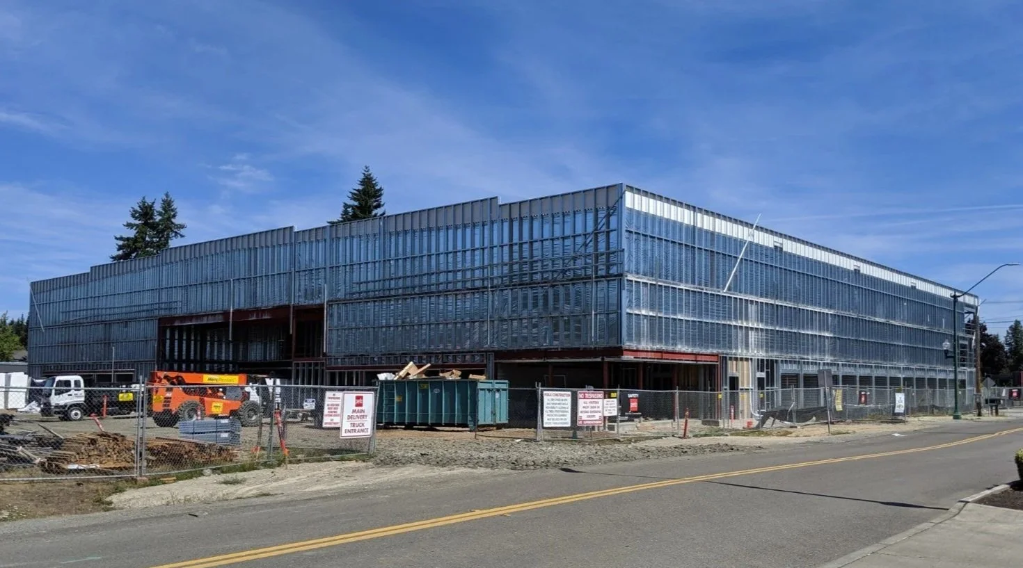
Design Schedule | June 2017 - Oct 2017
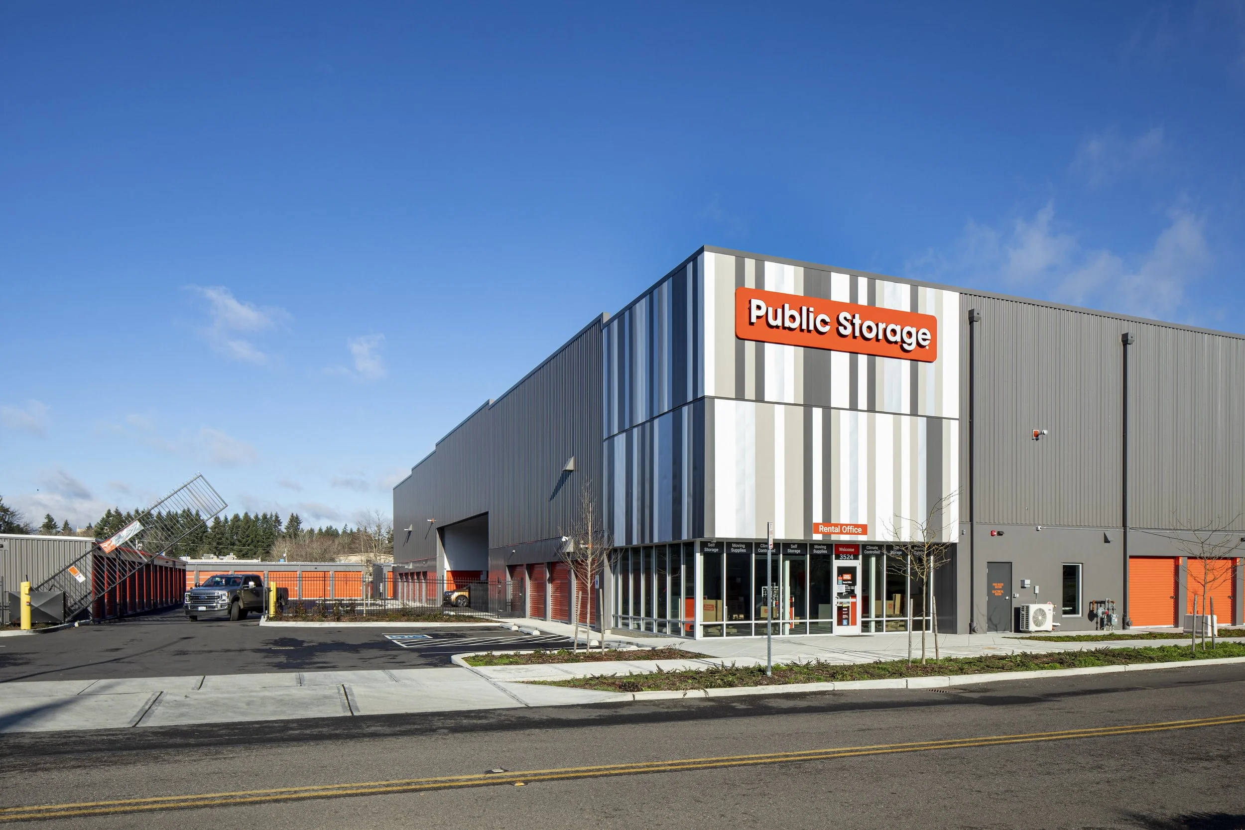
Olympia & Lilly Storage (OLLY) sits at 3524 Stoll Rd SE, Olympia, Washington, a practical address a short turn off the I-5 corridor. The site lends provides straightforward access for customers and delivery vehicles, which is one of the quiet requirements of this building type. OLLY was our firm’s second self-storage commission, undertaken with a client who valued clear design thinking and was open to breaking a few design barriers in an industry that is usually handled strictly as infrastructure. The client’s open mindset allowed us to test small moves—proportion, rhythm, color, and light—within a framework that still prioritizes efficiency, durability, and simple operations.
If there is a theme that ties OLLY together, it is the value of limits. The project embraces the limits of self-storage construction and uses them as a guide rather than a barrier. It accepts the primacy of function and engages it with modest architectural decisions that make the place easier to recognize, easier to use, and easier to maintain. That approach has produced a facility that does the basics quietly and well, and that offers just enough identity to feel at home in its neighborhood. For a typology defined by utility, that feels like the right measure.


Building Layout & Unit Mix
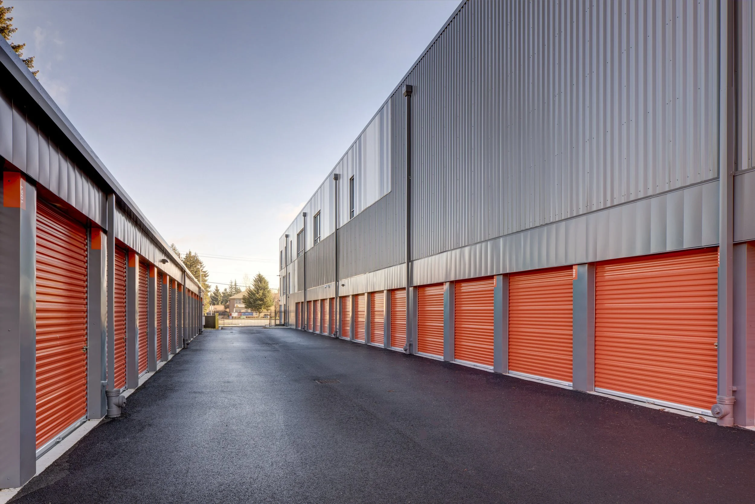
The campus is organized as four buildings: a three-story main building surrounded by three single-story accessory buildings. The main building houses the project’s public face—the rental office, entry lobby, and loading bay—along with an array of interior, climate-controlled units on all floors. Along the perimeter of the first floor, we introduced a band of exterior, unconditioned units with direct drive-up access. This mix responds to typical self-storage demand: small and medium interior units protected from weather and temperature swings, paired with larger, quick-access units for customers who prefer to park at the door. The upper levels are fully dedicated to conditioned storage and planned around direct, intuitive paths from elevator lobbies to unit fronts.

Self-storage construction differs from conventional commercial work in ways that are easy to overlook from the street. The unit itself is the primary module, and the building follows the logic of that module. Structural grids are set to repeat unit widths; demising walls must be quickly assembled, durable, and secure; and corridors are sized for dollies, mattresses, and boxes—not for retail browsing. Fire separations, door spacing, and travel distances all carry more weight than they might in an office building of similar size–the distance a patron is willing to walk down long corridors at an office building is very different from the distance they are willing to carry or cart a storage-unit worth of items.
The materials palette is purpose-built:
steel framing or pre-engineered systems
slab-on-grade with clean slopes to discourage ponding at door thresholds
metal panel cladding that installs quickly, and
standing-seam roofs with long service life.
Where buildings approach the property line, CMU offers mass, impact resistance, and a robust fire-resistive barrier; at other faces, light-gauge exterior walls with insulation and metal skins keep weight and cost down. On the inside, partitions are typically galvanized panels and light-gauge framing designed to be reconfigurable, so unit mixes can shift with demand without major reconstruction.
Design and Construction of Self-Storage
At OLLY, we adopted these norms and looked for places where a small design decision could deliver major impact. The exterior color strategy deserves a brief note, because it is often the difference between a building that merely blends in and one that contributes a little character to its corridor. By randomizing color within a strict one-foot panel module, we were able to create a varied pattern that looks intentional up close and resolves to a calm field at a distance. We used one-foot-wide panel modules to generate a quiet but legible rhythm, then introduced stretches of randomized color within that grid. This is not a flourish so much as a way to give identity with standard components. Elsewhere, muted gray panels steady the composition and keep maintenance expectations reasonable. The storefront at the public areas uses a three-foot module. The approach is budget conscious as it uses off-the-shelf components and standard installation techniques; it simply sequences them differently. Over time, as panels need replacement, the pattern can be maintained without special orders. The storefront’s three-foot module works in a similar way: changing counts and positions within a fixed unit means the building can adjust as tenant needs or signage strategies evolve, while the underlying system remains familiar to installers. The randomized bands emphasize entries and corners and help break down long elevations without adding custom parts or complex details. By varying the number and placement of these sections, we could adjust daylight, views, and signage backgrounds while maintaining predictable procurement and installation.

Nighttime reveals another facet of the building. Interior corridor lighting—kept even and low-glare by design—reads through strategically placed windows, and a simple perimeter lighting strategy keeps edges clear without adding visual clutter. This approach supports site safety, highlights entries for first-time visitors, and avoids the overlit, high-contrast effect that can be associated with industrial sites. The idea is consistent with the rest of the project: do no more than needed, but make the necessary things legible and calm.
The single-story buildings are deliberately direct. They are divided into larger units that benefit from drive-up access and quick turnover. CMU walls define the edges where the buildings approach the property lines, and steel-stud exterior walls support the metal siding elsewhere. Standing-seam roofs and straightforward gutter and downspout runs simplify maintenance. Overhead doors provide reliable operation and clear wayfinding, and the door color aligns with the management company’s brand to give the site a consistent identity. These buildings require less mechanical complexity than the main structure, so attention is placed on weathering, drainage, lighting, and visibility—features that reduce long-term headaches for both owner and customer.
Making the Maze Make Sense
Inside the main building, the plan is a study in repetition with just enough variation to make the building work well. Unit fronts align to straight corridors with clear sightlines for staff and customers. Elevator lobbies are positioned to shorten travel from the loading bay, and there is room for staging during peak move-in times. The rental office sits near the primary entry to capture walk-ins and handle day-to-day operations without blocking the flow of carts and people. Climate control is designed for consistency rather than tight tuning; the priority is steady temperature and humidity that protect belongings without excessive energy use. Security integrates with the plan: controlled entry points, camera coverage along main circulation, and simple, well-lit paths that reduce blind corners.
The site planning follows the same logic. Drive aisles are direct and wide enough to accommodate moving trucks without complicated maneuvers. The loading bay at the main building provides weather-protected access and a straight shot to the elevator, which removes ambiguity for first-time users. Parking is close to the office without blocking the primary circulation. Landscaping is present and careful but not elaborate: it softens the long elevations, frames the public entry, and respects clear zones near overhead doors and fire lanes. Signage is integrated into the building envelope so that the overall composition remains orderly. In a use that thrives on clarity, the best compliment is when a new customer can orient themselves in minutes.
Becoming Self-Storage Architects

Learning the “ins and outs” of this building type took time. Early on, we discovered how strongly the unit module drives the rest of the system—structure, mechanical runs, egress, and even signage. We learned to balance live-load requirements typical of storage with column spacing that keeps corridors clean and units marketable. We also learned the value of using a limited kit of parts. In self-storage, every component commissioned outside the mainstream supply chain risks delays and rework; every bespoke detail adds cost and complexity with little upside for the owner. OLLY reflects those lessons. Where we could, we selected standard profiles and kept the number of panel types low. Where variation mattered—at the façade, entries, and storefront—we embedded it in the layout and color strategy, not in custom fabrication.
From the start, our aim was not to reinvent self-storage but to practice it carefully. The result is a facility shaped by modern design principles—clear organization, honest materials, and measured expression—applied to a use that benefits from restraint. The lessons we learned on our first facility helped us here: keep the kit of parts tight, let the unit module lead, place variation where it earns its keep, and design for operations as much as for the photograph. The three-story main building with its mix of interior and exterior units, the straightforward single-story buildings, the loading and circulation strategy, and the envelope of standard panels arranged with intention all grew from that approach.